Thursday 31 March 2011

Coursework Evaluation Presentation

After completing our whole promotional package, my group and I then had to produce a powerpoint that answered particular questions about our product and evaluated the whole process to the rest of the media class. The Powerpoint included nine screen grabs from our teaser trailer that showed how we had approached conventional elements of real media texts, three slides on each piece of our promotional package and other slides discussing how audience feedback had helped in the forming and overall success of appealing to our target audience. In what ways does your media product use, develop or challenge forms and conventions of real media products?


  • We showed that a black background and white font was conventional for a drama film.


  • We also expressed our reason for adding a red flower design to show delicacy and hint at the danger and violence in the film, successfully represnting our drama genre.


  • We explained that a generalised date is conventional of teaser trailers.


  • We also explained that the particualr date 'Autumn 2012' would enable us around a year to successfully build on our promotional package and consequently suspense.
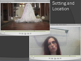

  • It was expalined that we had used the church and bathroom to make the mise-en-scene as realistic as possible.
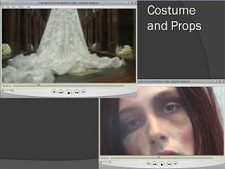

  • We said that we used the wedding dress trail to make our audience focus on the main character throughout the trailer whilst we tracked their movement up the aisle.

  • There was also the use of dark make-up to present bruising and represent the domestic violence and therefire the genre and possible narrative.
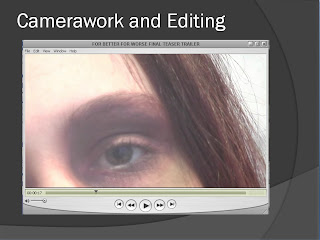

  • We showed the class that we used extreme zooms and close-ups to focus on the brutality of the bruises and therefore shock the audience.
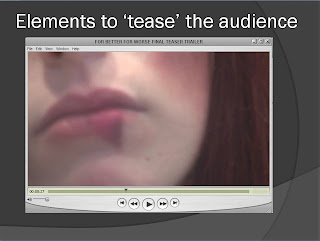

  • We made it clear that the extreme zooms and close-ups also successfully teased the audience, because they were unable to see the main character at full view until the very end, therefore creating tension and suspense.
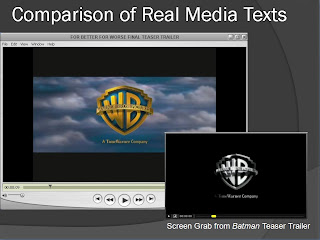

  • We chose the Warner Bros. distributors as they had managed to produce the BAFTA Award winning drama film 'Slumdog Millionaire' and because of it's success, we thought this would be the perfect instituation to promote our film. We were also hoping that FILM4 would promote our film, however, we were unable to find the FILM4 opening credit.

How effective is the combination of your main product an ancillary texts?


  • We compared our teaser trailer with the drama film 'Social Network' as there were many similarites including white fonts and black backgrounds and a slow revealing of the main character whilst a voiceover that hints at a specific narrative is playing.
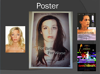

  • We presented our intial inspiration of the domestic abuse poster along with the Sleeping with the enemy poster to present similar conventions of a film poster, like the central image and black font for the title.
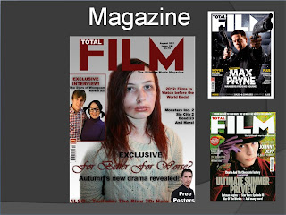

  • We showed the class how we had chosen Total Film for our publisher and therefore we had to find a font that was similalr to the actual magazine font. We explained that we wanted to maintain our red and monochrome colour scheme in order to maintain contunity and so our audience would be able to successfully identify themselves with the film.
What have we learnt from our audience feedback?

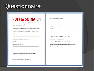
  • It was important that we explained why we had produced a questionnaire during the presentation. We explained that it was vital to understand our target audience and feel confident that we were successfully appealing to our target audience.
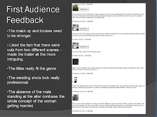

  • We talked about how our first audience feedback highlighted and pinpointed certain problems and improvements that could be made to our first attempt. The main problem was the make-up and effetively expressing our concept in the way that we wanted.
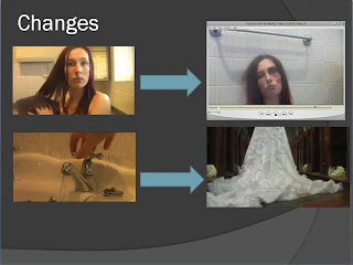

  • We talked about the changes that we made after our feedback in order to make our entire concept clear. For instance, we deleted all of the orignal shots that showed the main character without any scarring and replaced the opening of the tap running with just the bride to make things more simpler and to shcok and draw in the viewer instantly.
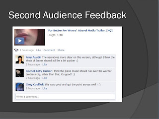

  • The second audience feedback was also used noted so that we were able to see where and if we had managed to imporve the presentation of our whole concept when it came to a drama genre dealing with domestic abuse. We disuessed the more positive feedback, especially concerning the clarity of our film.
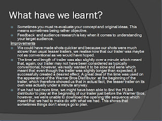

  • We notified what we had learnt from our audience as well as our own performance and product. It was also very important to note down the imporvements we would make if we had to complete this project again.
  • We also discussed the amount of technology and computer programmes we had used and also presented the benefits and drawbacks that were apparent with each one.

Thursday 17 March 2011

Our Final Teaser Trailer

Final Teaser Trailer


What makes this Teaser Trailer so successful?
  • We've been able to incorporate midshots, extreme close ups, zooms (in and out), tracking, voiceovers, music and fade transitions.
  • We've added a 'dream' effect on the wedding shots in order to make the wedding scene appear as if it is a flashback. This sucessfully presented elements of a narrative to the audience and took them on a journey.
  • We successfully kept our trailer immensely conventional by using distributors and typical black and white titles to make our film look professional and to show that our trailer was of a usual drama genre.
  • We tried our best to stick to the conventional running time of one minute and although we may have gone slightly over the minute, we believe this was only because of the length of time of the Warner Bros distributor at the beginning of the trailer.
  • Our trailer was very straight and to the point, which we all feel presented the concept very well, because our target audience was able to understand what was happening and were therefore able to gain an idea of what the plot genre and narrative was.
How have my skills developed from AS?

I would definitely say that I have developed my skills greatly since the AS piece. I'm definitely much more confident with using movie making and editing programme Pinnacle as this year I was given the opportunity to edit the footage and video clips, which now means that I can use technology with much more ease.
I have also become much more independent in my own study, especially when it came to genre and audience research. I had a great deal of input when it came to forming and creating a questionnaire and thinking of questions to ask our target audience.
I'm now able to talk more and discuss more with my group even if there were times where we did have disagreements. We also became much more critical when it came to viewing our footage because we wanted things to be as good as they could possibly be. This meant that we filmed some of the shots a number of times.
Because I have also developed a wider knowledge of media and the influence they have on the sucess of films, I have become much more analytical when it comes to posters and film magazines. I also have a greater knowledge about the difference between normal trailers and teaser trailers, and I know that at AS level, I would have known nothing about trailer and teaser trailer conventions.
One of the main things that the group and I have learnt, is that audience feedback is extremely important, as you are much more confident in your decisions when you know exactly what your audience want. The group and I were also able to use my skills from knowledge of Photoshop when it came to the poster and magazine. I thought that it was good that many people in the group used their knowledge of Photoshop to create something professional looking.
Overall, I would say that the co-operation of a group is one of the most important things to remember, and I was definitely say that this year, the group had been able to converse much better with each other when it comes to creating and sharing imaginative ideas. Preparation is extremely vital and there was a great deal of planning that we had to do in order to ensure that our filming was a success. I would say that we are certainly much more prouder of this piece, because we took the time to organise each step in the forming process and despite having to film certain bits numerous times, I feel that we managed to maintain our determination to produce a promotional package that was extremely successful.

Monday 14 March 2011

Teaser Trailer Decisions

Throughout the last week, it soon became apparent that we in actual fact had two teaser trailers that were both good enough to be used as our final product. This caused the group to discuess which trailer we should use, as both had particular elements that made them successful. Both presented a great variety of shots, including tracking, extreme zooms and midshots, which consequently made our decision all the more difficult.

What did we like about the First Trailer?

  • We were able to show a range of different shots and these were shots that showed a great amount of action.
  • We thought that unveiling the marks gradually mean that our target audience would be successfully shocked.

What did we like about the Second Trailer?

  • The second trailer may not have had as various and interesting shots, however, we all agreed that the 'meaning' of our film was conveyed much clearer, mainly because the make up was more prominent (presenting brutal domestic violence)

  • It also excluded the 'normal' behaviour of the woman. There was no drying of hair with a towel and no application of mascara which meant that the audience was more aware that the main victimised character was unable to go about her 'day to day life' and therefore symbolise the power and control of domestic abuse.

Audience Feedback/Opinions


The Facebook Feedback of the Second Trailer

The main purpose was to convey the meaning clearly and as a result, we decided as a group to ask our own target audience for their opinions of which one was better. Most people agreed that they understood events and the desired meaning in the second teaser trailer (as shown above), which therefore led us to have the second teaser trailer as our final trailer and the one that we would present as our final product.

Monday 7 March 2011

Teaser Trailer: First Audience Feedback

For Better For Worse - The First Trailer

What did people say and what did we learn?

Here is the feedback that we gathered from various people on the sicial networking site Facebook. Despite displaying our video to people of a younger age group, we felt that gaining a general view from a variety of age groups would be ideal, because the more feedback and opinions that were expressed, the more it would make us think about what to improve. However, even though we managed to gain feedback from a younger audience, we also managed to show people of our target audience, just by simply playing them the video.

Some of the Audience Feedback from Facebook

  • Try to make the make up more obvious and much darker
  • Make sure the voiceover is clear enough for people to hear what is going on
  • The music is very suitable for the genre
  • The church shots looked very professional but were a tad shakey at the end.
  • Perhaps the desired concept isn't that clear, so we should attempt to rethink how we present the marks and the domestic abuse.

Feeback from our Target Audience

"I really like the concept of the film, but I still think that you need to emphasise the make up so that people know what is going on."

"The wedding scenes look really professional and the music really suits the drama genre."

Improvements and Group Decisions

We decided that after looking at the feedback we were given, it would be best to refilm the bathroom shots and focus more on showing the marks through shots rather than a gradual unveiling of the abuse to keep things more simple and avoid confusion of the sudden appearance and disappearance of the marks. We also though that by making the make up look more realistic, our film would look much more professional and successfully achieve our aim of shocking the audience. We didn't think that the shake of the church shot seen at the end of the trailer was too much of a problem and we were pleased that everyone thought the music suited the mood and genre.

Our Final Poster

The Final Poster

Our Poster Research and Influence
We decided to analyse the Slumdog Millionaire film poster in order to see the specific elements of a conventional film poster. We chose to analyse this particular film poster because it is also a Film4 and Warner Bros film and we therefore thought it would be suitable and accurate when it came to presenting distributors and the information that is usually displayed, like the directors and actors names.


Feedback
People seemed to like the fact that we kept our poster simple. They liked that the image was in the centre and that there were two halves, one showing the normal face and the other the real, beaten side as this shocked and consequently drew them to the poster, knowing instantly that it was a drama film dealing with issues of domestic abuse. They really liked the slogan because it also told them alot about the plot and said that it was so catchy that they would be able to remember it.

Our Opinions
As a group, we were extremely pleased that the font and colours came out very clearly and boldly.We also managed to find the distributors logos and signs which made the overall poster look extremely professional just like Slumdog Millionaire.
We particularly liked the fact that, in this case, less was more effective and that the image and title were the aspects that mostly stood out, because these were the aspects that were most important when it came to rememberence of our film.

Sunday 6 March 2011

Our Final Magazine Cover

Our Final Magazine Cover

What makes it successful?
    • We are proud of the professional looking colour schemes and we feel that with the monochrome and red colour theme, it was effectively stylized.
    • We have a central image that intrigues the audience. The amin character is looking directly at the potential buyer which sucessfully helps our aim of attracting our target audience.
    • We liked the fact that our cover was clear and allowed the relevant information to be displayed wthout being overcrowded by other infromation.
    • It is extremely conventional with the elements we included and our research of the 'Total Film' magazines meant that our cover looked realistic.
    • Our questionnaire also helped us in making the magazine cover accurate. e.g. the price we displayed was a cost that was said to be acceptable in our questionnaire.
    • We were pleased with the fact that we managed to get the 'Total Film' font and style relatively accurate.
    • We included the other group's films so that we advertised without copyright and helped promote their films.

Comparing Our Trailer to Media Theories

Feminist Theory/Theorists

Initial attempts in the United States in the early 1970s were generally based on sociological theory and focused on the function of women characters in particular film narratvies or genres and of stereotypes as a reflection of a society's view of women. Works such as Marjorie Rosen’s Popcorn Venus: Women, Movies, and the American Dream (1973) and Molly Haskell's From Reverence to Rape: The Treatment of Women in Movies (1974) analyze how the women portrayed in film related to the broader historical context, the stereotypes depicted, the extent to which the women were shown as active or passive, and the amount of screen time given to women. - Information courtesy of Wikipedia.org

Laura Mulvey - The 'Male Gaze'

The Male Gaze is a theory that argues that alot of films are usually viewed and presented from and by a male perspective.

In cinema theory, Laura Mulvey identifies the male gaze, in sympathy with the Lacanian statement that "Woman is a symptom of man." This means that femininity is a social construct, and that the feminine object the object petit, or the object of desire, is what constitutes the male lack, and thus his positive identity.

In film, the male gaze occurs when the audience is put into the perspective of a heterosexual man. A scene may linger on the curves of a woman's body, for instance. Mulvey argues that in mainstream cimena, the male gaze typically takes precedence over the female gaze.- Information courtesy of Wikipedia.org

How does this relate to our own film? There are often a few shots in our teaser trailer that show the woman on the floor with a high angles shot successfully dominating the woman. This implies that she is a victim and is inferior and therefore hints at the narrative.

Carol .J. Clover - The 'Final Girl' The 'final girl' is a horror film trope that specifically refers to the last woman or girl alive to confront the killer, ostensibly the one left to tell the story. Althought our film is not a horror, we are able to relate to the particular ideology of having the woman being victimised in a film. Clover argues that for a film to be successful, although the Final Girl is masculinized, it is necessary for this surviving character to be female, because she must experience abject terror, and many viewers would reject a film that showed abject terror on the part of a male. - Information courtesy of Wikipedia.org

How does this relate to our own film? This shows that audiences can in some ways, relate to a stereotypical way of viewing males to be more superior and stronger than women. If our piece was in actual fact a real film, we would most likely show a scene that had our main character portrayed as a 'final girl', because she would be threatened and would have to come up against her violent husband.

Monday 28 February 2011

Titles and Font Analysis

We decided to look at a variety of drama film teaser trailers on the video sharing site Youtube in order to complete our research and understand the conventional fonts, styles and colours that usually appear in drama films.

'Social Network' Trailer Font

'Glory' Trailer Font

After researching the fonts, styles and titles, we soon discovered that simple white fonts displayed on plain black backgrounds were the conventional style of a film with a drama genre. This is most probably because the colours are monochrome and therefore mature and simple, therefore successfully appealing to an older audience. We wanted to be conventional as possible and keeping this knowledge in mind, we used the website dafont.com to find various font and text styles.

Teaser Trailer

In our opinion, the font we decided to apply suited the drama genre extremely well, mainly because it was so conventional and stood out against the black background. We also wanted to add something else so that our audience would recognise the film later on, and we consequently decided to add a small design, a red, flowery pattern that intertwined with the bold, white font. We thought this specific red flower design was very effective in representing the delicacy as well as the danger in the film and we loved the way that the intertwining of the flowers with the font almost made them look like thorns.

Film Poster
The writing styles for our film poster were also monochrome because it has a Black, white and grey theme. By using these particular monochrome shades and tones, there was nothing to bright, which therefore meant that we appealed to an older audience. The shades implied that our film was a serious and mature, suiting adult viewers.


Fonts
When it came to the 'For Better For Worse' and 'Autumn 2012' writing, we chose to use an Arial Font, mainly because it was simple and therefore suited our mature audience of middle aged 30 year old women.We wanted to make the 'worse' stand out to our target audience so that it would shock and intrigue them and as a result, we chose to highlight this particular word in white, so that it would stand out against the character's dark hair. Again, we wanted to stick with our usual colour scheme and keep the poster as simple as possible so that the audience would have to use a greater amount of imagination in order to guess what the storyline and genre was.

Magazine
When it came to designing our magazine cover, we thought it was important to be consistent with our 'mature monochrome' theme, however, we also wanted to add another colour so that the front cover would stand out and be seen. After some deliberation, we all agreed that having black, white and red, which were the colours we used for out displayed title at the end of our teaser trailer, along with white/grey background would be most suitable, because our typical mature colours were stylized and successfully symbolised the issues of our film. (For example, the red was a represntation of the violence and danger.) It was extremely important that our audience successfully identified the colours with the film genre and we felt that these particular colours were in actual fact, very professional, because they allowed us to keep the cover simple without overcrowding other information displayed.
The Fonts

Here we used the Motor oil font in order to make the 'Total Film' title as accurate as possible. It was important to us that the font we used made the title look like the real thing.


We also used theVivaldi font for our presentation of our film title. We chose this particular font because to us, it appeared elegant and looked especially like old fashioned wedding type writing. This would also give the viewer a clue of the genre and hint at a possible storyline.

We also used arial block capitals in 'EXCLUSIVE' and exclamation marks in 'Autumn's new drama revealed!' in order to capture our audience's attention and by using black and red as our font colours, we were therefore able to make the font stand out from the white background.

Friday 11 February 2011

Editing

Decisions and Revisions of Teaser Trailer, Poster and magazine

Teaser Trailer
As a group, we revised the second filmed clips of the bathroom shots and realised from people's comments that it wasn't quite clear that we were trying to reveal each bruise and mark from a mid-shot of an unmarked woman. Some people said that it might be slightly confusing and so we had to think of how to acheive a shock without confusing the audience about what was truly happening. We then decided that it may be better and even more mysterious if we only showed the scars and marks on the body, revealing the entire woman's face at the very end of it all. because this would mean that we could make the main character even more mysterious, because it would only be a brief introduction and glimpse of what she looked like.

Magazine
We worked extremely hard on making the magazine as professional as it could be possibly be. We knew the importance of researching and noting the conventional layout of a usual film magazine fron cover and from the research, we knew that including as much infromation without making it look too overcrowded was vital when it came to presentation and audience appeal. From the magazine cover below we knew that we had to include elements such as taglines, titles, central images aswell as advertisments and information on upcoming films. We tried to keep the colour scheme simple and used a gradient which instantly made it proffessional looking with two different shades of colours.


Poster
It took a while for us to decide on the writing and font on the poster, however, we tried to compare it to other posters advertising movies of a dramatic genre. We made the main title the biggest piece of font on the poster so that the it would stand out to our target audience and so that they would remember the name. We also tried to make the date relatively visible to remind the audience of when the film would be shown. Used a domestic violence poster as an inspiration for our poster and also took the poster 'Enough' as an influence when it came to having the main victimised and vulnerable woman as the central image. To us, the image looked as if it was a police shot which gave a slight hint of the plot and storyline, but still left elemts of the film mysterious and rather shocking. This made our poster in our opinion, extremely effective and we feel that we have managed to fulfill our purpose.


Installing Copyright Free Music
We found our desired music on the website audio.lgfl, a site that allowed us to download copyright free music that we would place in our teaser trailer.
After much searching we finally dowloaded and saved the piece of music into our computer database so that when it came to opening Pinnacle, we were able to drag the music into the audio section and then edit it so that it sycronised with everything else. It took us quite a while to find appropriate music as we wanted something classical, orchestral and piano like, but we wanted it at a relatively slow and also at a nice, steady pace.

Friday 28 January 2011

Evaluation of Filming

TEASER TRAILER QUESTIONNAIRE/EVALUATION

Film Name: For Better For Worse

Date of Release: Autumn 2012

Were there any fast cuts like in the Harry Potter teaser trailer (45 cuts in one minute)?
No, this is because we wanted to create a slow pace in order to suit our drama genre.

Was there an extremely long take like The Omen teaser trailer?
No, because we wanted to represent reality as much as possible, which meant showing more scenes of the mise-en-scene, especially in the bathroom.

Were there expectations for the film to reveal itself slowly?
Yes, we aimed to attract our target audience of adult women by showing that our film was of a dramatic genre. This meant revealing clues of the narrative and storyline slowly and gradually and successfully presenting a trailer that really managed to 'tease'.

Was there material that was filmed especially for the teaser trailer like Toy Story?
There was a great deal of material that was filmed especially for our trailer. When trying to represent the marriage of the husband and wife, we used shots of a bride walking up a church aisle to emphasise this. The bathroom shots revealing marks and bruises were also used specifically to hint at the plot and narrative, elements that are extremely important when it comes to attracting a specific audience.

Is there an introduction to the main characters?
There was no real clear introduction to the main characters apart from the woman that would be at the centre of the story, meaning that out purpose of 'teasing' our target audience was fulfilled. The advantage of also just showing the woman mean that the audience would be able to identitfy themselves with the 'main' character already and because of the character's gender, the audeicne of middle aged women would most likely feel that they would be able to relate to or understand this particualr character, before even viewing the film.

Were there any introductions to clues to the stroyline?
There were many clues to the storyline. The shots of the church as well as the voiceover of the wedding vows represented the marriage, the bond and the promise that was made between a couple, whilst the bathroom shots presented something that was much more sinister, shwoing the domestic violence and much more earnest side to the story. The shots themselves showed the dramatic genre.

Were there conventional transitions?
There were mostly very straight and therefore conventional cuts to seperate the scenes. This made the trailer quite natural and therefore realistic, however the black fades also made the overall trailer rather dramatic, suiting the genre.

Were there elements of intrigue?
The group felt that the shots of the bruises created a great deal of intrigue, mainly because at first the audience do not even see any marks, so the sudden appearance of a mark is one that would successfully shock them. We also felt that the 'dreamy' effect we applied to the church shots effectively showed that the shots were in actual fact flashbacks.

Were there elements of anticipation?
The signs of domestic violence presented in the teaser trailer certainly presented elements of anticipation. I would also say that the slow pace of the bride walking down the aisle towards the alter in each church shot created a great deal of anticipation, mainly because it would leave the audience wondering what would they might see when the bride reached the alter. We also felt that the music which was a classical piano accompaniment successfully slowed parts of the trailer down, creating a lot of tension.

Was there sound or music?
The sound of the voiceover appeared to work extremely well alongside the classical piano music. The voiceover was also extremely slow pace which made it very realistic to a typical wedding ceremony and exchange of vows.

Were there a variety of of camera angles/movements to demonstrate skill?
There were, in my opinion, a nice variety of camera angles and movements that presented a range of effects. We used tracking to follow the bride walking down the aisle, midshots to show that the woman shown was at the centre of the story (whilst also showing the setting that she was in) and also close ups to present the marks and imply that the domestic violence was an issue that the storyline would revolve around.

Final Evaluation
I think it is fair to say that we sucessfully acheived the short timing of the overall trailer however they weren't made up of very quick cuts. We showed that it was a drama genre by the mise-en-scene of common places in society like a house and church. The purpose was to attract an audience to create anticipation, to excite and to reveal the date of our film whilst still maintaining a great deal of mystery.

Friday 21 January 2011

Our Promotional Package

When producing our overall promotional package, it was important that we kept our audience and genre in mind when creating our teaser trailer, poster and magazine.

Teaser Trailer
What was the purpose?
To attract and intrigue our target audience.

As a group, we decided to attempt to represent the gender in order to appeal to the female audience and to also show the stereotypical view of males being more superior to women and the 'supposed' reality of social issues, crimes and in particular prejudice against women. We used this stereotype to be convential and enable the audience to identity the social realities. In some ways, we could say that our package represented Laura Mulvey's 'Male Gaze' theory in the way that the woman is seen as the vulnerable, fragile, weak one. On the other hand, we could say that because the female is the centre of events, she has a story to tell and could consequently be the one to overcome struggle and almost be an inspiration. We really attemtped to make our audience recognise the dominant ideology of stereotpying women as weak and inferior to present our socially dramatic genre and in order to achieve this, we tried to make her seem like a typical woman by using props and mise-en-scene, like the make up in the bathroom shots to represent her stereotypical feminity. This also meant that we were attempting hegemony.

Poster and Magazine
What was the purpose?
To advertise and therefore attract our potential audience.

In my opinion, the images shown on both our film poster and magazine really showed the dramatic genre of our film. We wanted to make both images extremely dramatic and therefore almost like a statement, presenting issues of domestic violence. Our main purpose was to shock our target audience and we used the computer programme Photoshop to make the poster and magazine much more dramatic. We also tried to make the poster image look like a Police snapshot shwoing the evident bruises and marks to give the audience a hint of the storyline and narrative.

Order of promotion
Conventionally, the teaser trailer would be the first thing to be shown, following the poster and lastly the magazine. However, with the film Cloverfield, the teaser poster was the first thing to be published. The Cloverfield producers also included codes and underlying messages in order to encourage their audience to research their film.

Cloverfield: Pre-realease Plot Speculation

"Members of the forums at argn.com and unfiction.com have investigated the background of the film, with the "1-18-08" section at Unfiction generating over 7,700 posts in August 2007."

Our group however, decided not to do this, mainly because our film was a drama rather than that of a 'distaster-monster' genre. We wanted to keep things as real and hard-hitting as possible, which meant that our film would most likely be seen on TV on a drama film channel (like our film distributor FILM4.)

Thursday 20 January 2011

Church Filming

As soon as we arrived at the church we immediately began to set up the wedding decorations. We used the small platform to film the walking up the aisle and made sure that the whole of the church and mise-en-scene was perfect for filming. This included making sure the lighting was suitable and the angles were just right.

We then decided, that rather than just filming the back of the dress being trailed, we would also film it with the camera reamining still and also from the front so that we would have more to experiment with when editing, and produce something out of a variety of shots from many different angles, even if we didn't end up using them.

We decided to show that the bride was alone and isolated by filming a shot of just her hand and the rest of the empty church, which to us, was very symbolic and ultimately perfect for a 'teaser' trailer. We filmed the empty church in case we wanted an establishing shot or a closing shot to again show the isolation that the bride feels during the trailer.

Overall, the entire group beleived that the filming was very successful because we had the time to do more than the minimum and instead experiment with what we had. We uploaded our recording to the Pinnacle programme to edit and experiement with the film.

In the end, we decided not to use the hand or the establishing shot of the church as we just wanted to stick with what we orignally had so that the less there was of the surroundings, the more mysterious the trailer would appear.

This is the a picture of the inside of the church and the aisle that we used. We thought it was the perfect size when it came to filming.

Friday 14 January 2011

The Planning Process

Roles of the group
It was important to organise and plan who would be undertaking particular roles before filming anything at all.

After some group discussion, we decided that I would be the woman acting in the film, mainly because I didn't have the opportunity to appear in our AS piece, which therefore made the roles of the group much fairer.

It was then decided that Mark would be the prime person to edit the film, even though all four of us would still have a reasonable input. Because of his knowledge of computer technology and software, we thought that it would be best if he was put in charge of finding the institiutions, distributors and titles that would appear in our film.

Jen and Lauren on the other hand would be the main two people who would be in charge of filming and organising the make up. This meant that they would have to complete some research into making the bruising and scarring look real, which consequently meant that Youtube videos would have to be studied and used as part of the research. They would also have to undertake the responsibility of taking the photographs for our poster and magazine.

Prop/ Mise-en-scene list

  • Dark make up for bruising
  • Mascara
  • Bathroom
  • Church
  • (Camera)
  • (Edirol)

Planning process
One of the main things we had to produce as a group was a film schedule in order to know what we were doing and when we were filming.


Our filming schedule

Our filming schedule was something that really helped when it came to our organsiation as a group. The columns of our schedule included the dates of when we would film and also when we would spend time working on other parts of our promotional package. We also decided to note down what equipment and props we needed when it came to filming on Thursday 6th, 13th and 19th of January. This meant that we were able to arrange who would take responsibility for certain aspects of our filming and work together as a group.

Thursday 13 January 2011

Organising Our Filming

Looked at our filming schedule and realised that the 13th January was the day we were meant to devote our time to filming at St. Margarets Church in Rainham. We had emailed the vicar of the church before hand explaining that we wished to film a scene of a bride walking up an aisle and luckily, we received confirmation that we would be able to film on the 13th.


Here is the email sent to and from the church

However, after discussing the filming date as a group, we felt that we should really think about how we were going to film the wedding scene, whether St margaret's church would be appropriate and of course, to introduce ourselves and explain to the vicar what we were planning to do in further detail. So, instead, we went to the church and worked out how we would film the scene and how we would acheive something that looked really quite professional.

We managed to find a small platform (that was on wheels) which meant we were able to move across the church floor with ease and after recording an example of walking up the aisle we found that it was perfect for following the bride.


We then thought about placing the 'mysterious husband' at the alter so that when the bride ended her walk, she would be seen standing next to the groom and then instantly, in another shot, her standing in the church, on her own. We soon realised that by simply going to the church to plan and think about our filming, new and fresh ideas were created and therefore felt that the short trip to the church was extremely worthit. In the end, we chose not to use those shots because we thought that isolating the bride would convey a sense of isolation, however, having those shots meant that we were able to decide what we thought was best as a group.

This meant that we then wanted to reschedule the real filming for the following thursday (the 20th of January) and the vicar was more than happy to agree to this. We had a much clearer vision of what we wanted to achieve which consequently made us much more confident in our film planning.

Saturday 8 January 2011

Questionnaire & Audience Research


We decided to create a questionnaire that we then gave to our target audience ( young/middle aged women) in order to see what appealed to them so that we would be able to focus on making our own teaser trailer, as well as the magazine successfully appeal to them. We included questions that asked them personal questions about films (eg. what is your favourite film and why?) along with more specific questions related to our chosen drama genre. (eg. What is your favourite drama film and why is it so successful?)

What did we find out about our target audience and what appeals to them?
  • Most said the storyline and actors are the main elements that make a film successful. Our target audience also said that a 'thought provoking' story is something that would appeal to them.
  • Alot of the age group liked drama films (a vast majority voted for a drama genre as one of the top 3 films genres that they would watch) so we knew that our film would successfully appeal to our target audience.
  • Nearly all people said that moderate use of strong language would be most suitable, which meant that we knew how far we would be able to go with the violent language if it came to making our film for real.
  • All thought that a trailer made a big impact on the viewing of the film.
  • Most said they'd pay £2.51 for a film magazine. Our magazine was going to be issued by 'Total Film' and their magazine prices are usually in that price range anyway, which, to us meant that we had the right magazine publisher/distributor in mind.
  • Most people said that the actors, director, film review and genre were the biggest things that attracted them to the film.

Our questionnaire helped us immensely when it came to getting in touch with our target audience and understanding exactly what they wanted in a film. There were sections of the questionnaire that had a variety and mixtures of answers when it came to personal prefrences, however, there were also questions that enabled our group to accurately pinpoint the main elements that appealed to the audience. Because of this, I would say that producing and distributing a questionnaire was extremely benefitial.

Friday 7 January 2011

Using Media Technology - How has technology helped?

Technology played a huge role in the research and planning of our media piece. In almost every lesson we have used the internet in order to aid us with the researching of films, trailers, posters, magazines and extra elements to filming, such as the certificate information etc. It has also, of course, allowed us to track and reflect on our progress through the production of our online blogs and also using the video sharing website, Youtube for finding videos on how to approach make up for the effective use of mise-en-scene, as well as the reseaching of drama trailers for inspiration.
We have also, as expected, had to experiment with the camera so that our filming is of a clear and good quality and also use the editing programme Pinnacle to start to upload and edit our film.
Photoshop and Photoshop Elements has also helped us immensely when it has come to the production of Film Magazine covers and Film Posters, (both teaser and normal.) We all felt as a group that Photoshop was a computer software programme that woud enable us to create extremely professional looking advertising pieces of media, as we were able to add shadows, gradients, specialised fonts and text, which made us feel much more confident in our production and creative skills, a confidence that we have gradually gained after our AS piece.

What other technology do we plan to use?

We plan to be using the Edirol and microphone for the recording of the wedding vows soon after we have gathered and edited all of our fim clips together. By using the Edirol, we will be able to produce a professional recording of clear quality, which will therefore make our trailer extremely successful. We also hope to find a room with an echoing sound so that it appears as if the vows are being spoken by a vicar inside a church in order to make it appear extremely realistic and also create an eerie atmosphere.

Have we improved with our use of technology since AS?

I personally feel that after familiarising myself with various types of technology, I am now able to use Pinnicale much more conifdently, mainly because I have had the opportunity to experiment with our uploaded video clips after filming. I plan to become mre involved when it comes to the production and formation of the film poster and magazine, as I will then be able to use Photoshop too.